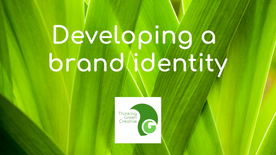
The history of a brand
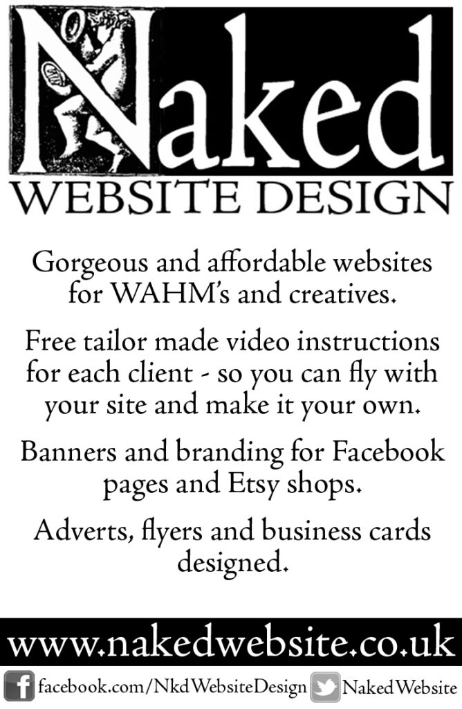
Before I was Thinking Green Creative I was Naked Website Design. The name isn’t as risque as the reality, which was a boiling hot summer and an emergency email from someone who needed a website that day. So I didn’t have time to get dressed.
My branding for Naked Website was stark black and white and my main logo was a woodcut of a cherub with the letter N over the top. I chose it because I liked it, and it reminded me of my son a bit. It had a kind of hand made look about it and reflected an interest in print technologies as well as the internet. The Naked Website brand served me well over the years. I designed a lot of websites for breastfeeding support sites and eco friendly retailers. I also worked with punk bands, blacksmiths and a whole load of creatives. I remain good friends with many of my original clients, some have moved on from what they were doing then, others still retain my design services.
The rebranding process
Since 2003 when I started Naked Website, things have moved on. Literally, the baby has grown up. I still work with lots of baby friendly companies but there is no way in hell I’d whip up a website in the nude. I started a masters in Design and I’ve added more skills to the things I can offer and worked out my niche, which is starting small and teaching clients what they need to know. I still have all of the values of Naked Website Design but my focus is sharper. I’m incorporating all the experience I’ve had writing www.less-waste.co.uk and www.less-stuff.co.uk in to my design work and as an ethical designer, I want my clients to become sustainable. I also teach (and use daily) Design Thinking, which is a human centered approach to solving problems with innovation. The new logo for Thinking Green Creative had to say all of that without words.
Logos have meaning
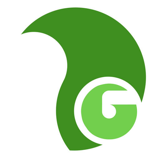
For the new logo the colour was easy. I knew I wanted shades of green, not too in your face but fresh and clean looking.
The T of the logo is a tree, solid and dependable but flexing in the wind when it needs to. This represents me, my years of experience designing and my adaptability. Commission me to do your website and we might start work on your Instagram first. We start with talking and adapt and build on what you, the client really needs. The T wraps around the G, holding it safe and secure but not trapping it. My intention is to teach the client what they need so they can leave when they want to. I work like this because I want to empower people to run their own websites with confidence.
The G is an apple and the letter G is a spiral. This represents the client, starting small, building and growing and eventually falling from the tree to a soft landing where they can grow on their own.
The whole logo fits in a circle, representing the circular economy, the world, our gorgeous green planet.
It’s not just a logo, it is a whole communication about why I do what I do and what I can do for you.
Start with why you do it
When I work with a client I ask loads of questions to get to the root of why they are doing what they do. This is a design thinking method of reframing and redefining the brief to get to the real nitty gritty. It is the strategy that has worked well with these logos.
Shel Banks and Janet Beech are specialists who work with mothers of new babies. Shel is obsessed with purple and wanted something friendly and approachable. There is a little texture in the footprint that softens the logo. Janet’s logo is made from the letters of her name and plays on the tree element in her surname. She wanted her logo to reflect the growth and development her work brings.
PLAN Easton and Lawrence Hill campaign against planning applications that have a negative impact on the local area. The blue background is the shape of the district on a map and I used guidelines in the lettering to invoke an architects plan – also the blue refers to blueprints in a planning office.
Exeter Family Activities was made from cut out letters scanned in and photoshopped. The client wanted something really friendly that looked handmade and professional at the same time. It is actually her family, she has 2 girls and a dog.
Baggator Nexus is a community organisation that umbrellas many others. This is a holding logo, made deliberately neutral so it can be changed in the future.
The Introducer is a global magazine that focuses on innovation in science, technology and healthcare. They needed a logo that represented connections. The colours have a medical clinic feel to them which is perfect for their remit.


Want to go it alone?
Please don’t buy a logo from Fiverr. It will not be unique to you, you might see it pop up used by people who don’t reflect your ethos. Please don’t use a stock image for the same reasons.
Doodle, draw, cut and stick to get an idea of what you need to get across. Talk to people, ask for critical opinions, don’t ask people who will love anything you do unconditionally. And if you don’t have the skills to make it look polished please invest in yourself by getting in an expert to do that for you.
I’ve just finished reading “Find Your Why” by Simon Sinek and I can recommend it as good reading. Sinek explains the importance of promoting why you do what you do more eloquently than I can.
Want to talk about it?
Talking about branding is genuinely my idea of a good time, so please get in touch if you want to chat. I offer 30 minutes of free consultation time and I’m generous with my knowledge.